
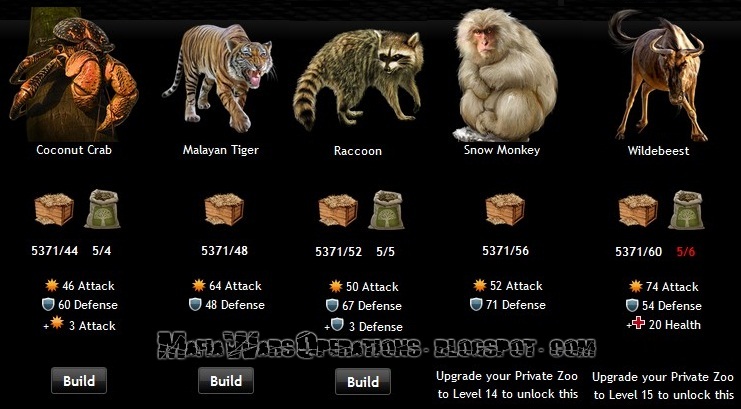
 Well it's about time they gave the armory and zoo a few more upgrades! Now you can build each up to level 15! And if you want you can spend some reward points to get them built at a discounted price! Otherwise it's just the normal items required, so get to it and build some great new items! And at least there's a few things worth it!


Hi, this comment is off topic but you really should take it into consideration. I'm a daily player lvl 670 (doesn't really matter) but just something I would like to suggest.
ReplyDeleteIn my humble opinon the text on the website needs changed, the color works fine (glad you didn't make the mistake alot of myspace users do of using the same color as stuff in the background making it unreadable, while there is grey lines the color is a different shade easy to see and read) but the font is another story.
Sure the font looks cool, "gangster" and "Mafia graffiti style" as I'm sure it is intended to be. But just for ease of use it would be better off as a more common looking font. It is much harder to read than same Times New Roman or Aeriel or etc, surely there is a "gangster" type font that is more readable. Just would make the site much better and users like me would be able to speed read it with ease.
Anyone else have comments or opinions? Maybe you could start a poll, and I don't have time right now but some other fonts could be compared, just make a few of the same pages but change the font in the HTML as preview pages basically for users to look at and see what looks best. Or you could just take some screenshots of the results.
Anyone agree a font that is easier to read would be a nice change?
Take it easy,
Brad Smith (Be Rad on Mafia Wars)
The text in the comments makes me think maybe the shade should be a tad brighter since of the dark background, the font really isn't that bad but it's a bit slanted/seems to run into itself at times. I think a similar font could be used just should be more straight and maybe if the hue is just a slight brighter. A much more simple font would be the best though IMO.
ReplyDeleteCheers
I still believe that the font should be easier to read and a shade brighter too perhaps (esp. in the comments section and spots that the text size is set smaller) anyways as I meant to say on topic in my original post this is much due and they need to update the crime spree safes! I'm glad I have a mafia over a thousand active members (I purged out hundreds), I love the addon and use it daily but for this the plugin Bagman Mugger will come in hand in use with Free Gift-a-nator, just a tip.
ReplyDeleteBrad
I'll take that into consideration If I decide to do a redesign.. but considering this is the first time i have heard of it even being an issue.. it sounds extremely minor and not the voice of a majority. But thanks for your input. :)
ReplyDelete